
A conceptual coffee brand built around bold typography, premium positioning, and contemporary packaging design. Origin explores how simplicity, scale, and restraint can create a distinctive presence across both retail and takeaway environments.
brand design • packaging system • Product VISUALISATION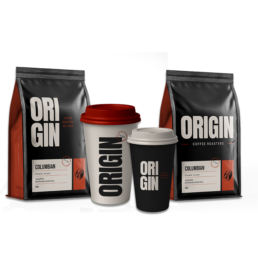

THE CHALLENGEMany independent coffee brands rely on familiar visual cues that make differentiation difficult in a crowded market. The challenge was to create a distinctive brand system that could command attention through typography, simplicity, and confident use of scale while remaining flexible across multiple touchpoints
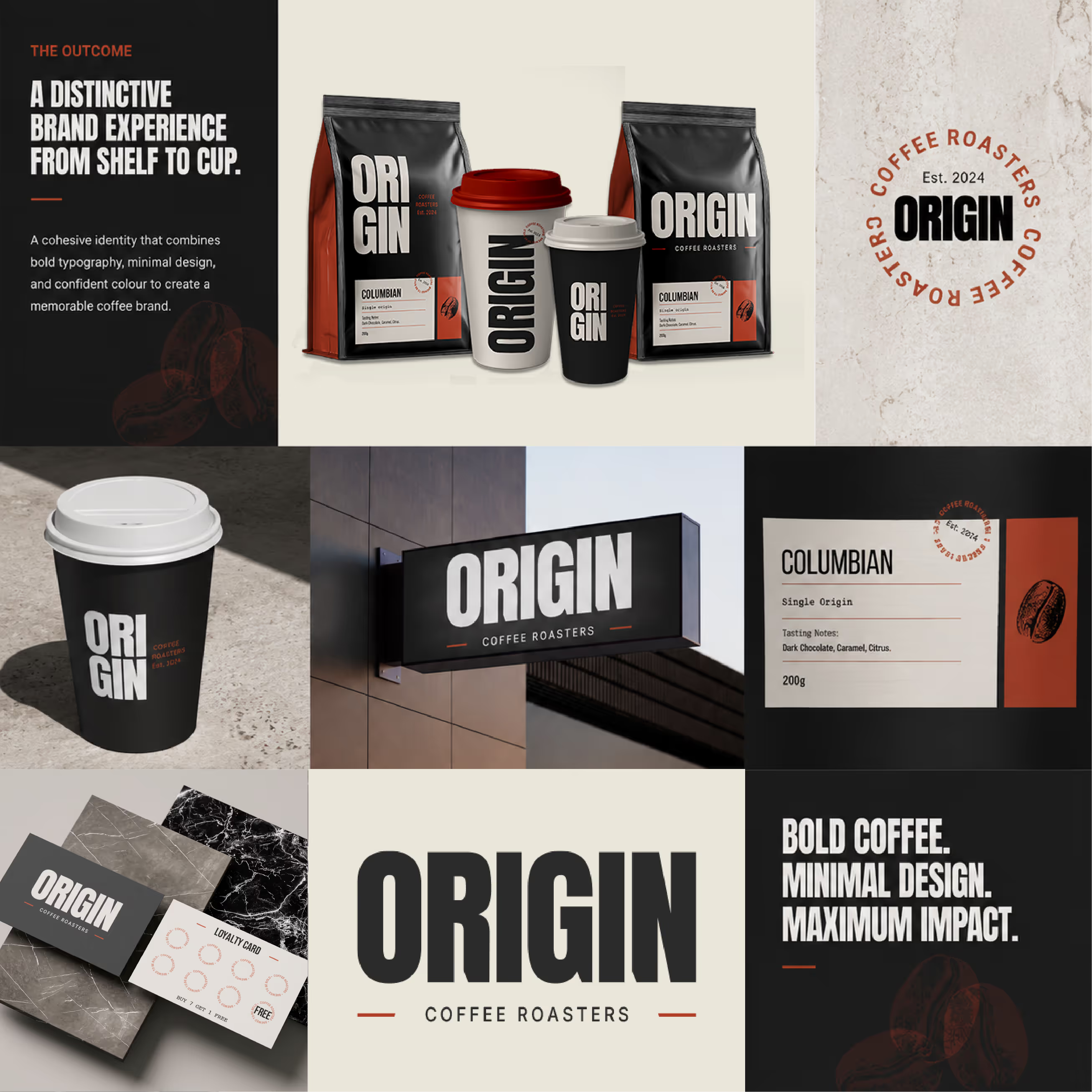
THE APPROACHTHE OUTCOMEOrigin demonstrates how bold typography and disciplined design choices can elevate everyday products into memorable brand experiences. The resulting system creates a strong visual presence that feels modern, confident, and highly adaptable across retail and hospitality environments.
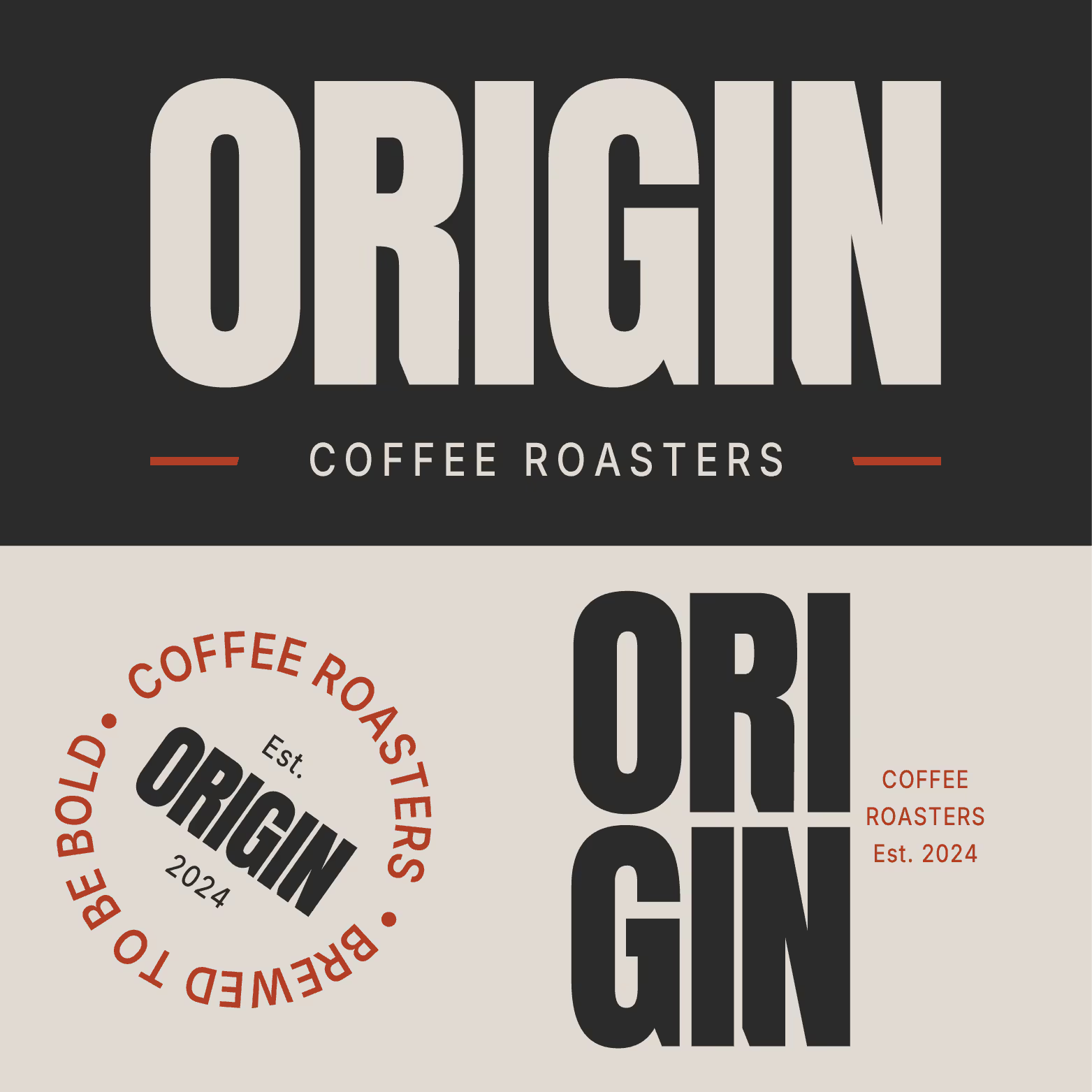
Developed a bold visual identity centred around oversized typography, strong hierarchy, and a highly recognisable brand presence.
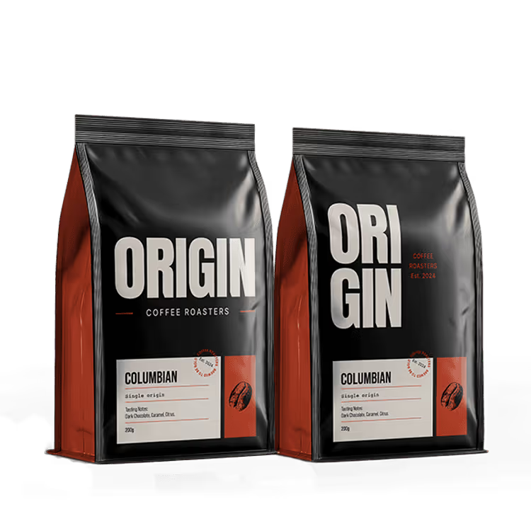
Designed a typography-led identity that shifts between stacked and horizontal configurations, balancing maximum shelf impact with practical application across different packaging formats.
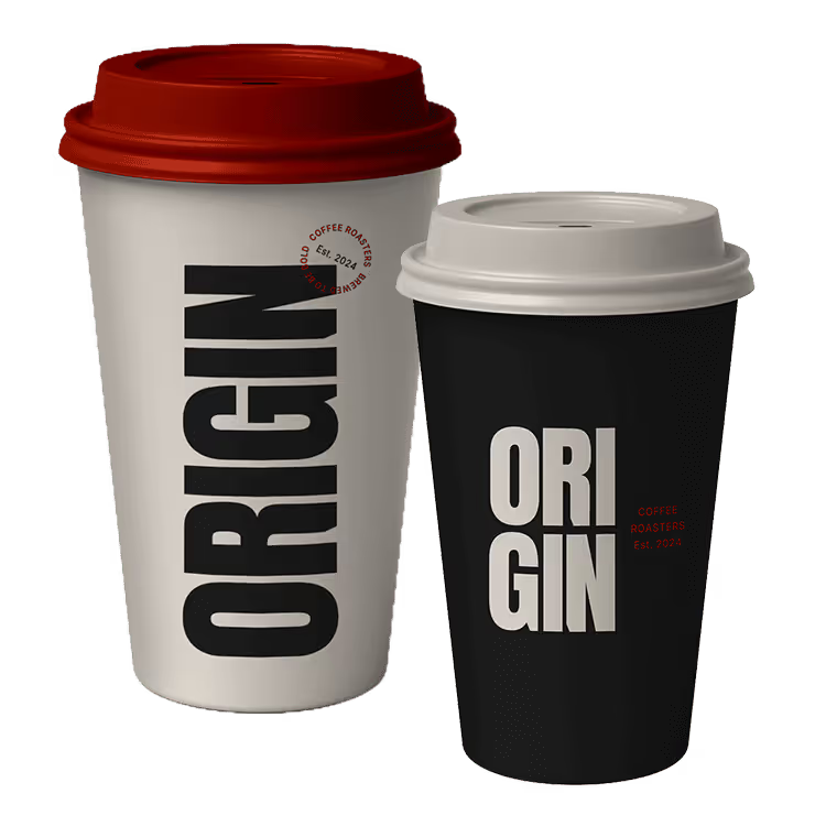
Extended the identity into branded takeaway cups and supporting materials to ensure a cohesive customer experience.
Designed a system capable of expanding across future products, retail environments, and digital touchpoints while preserving brand recognition.